Level design A1
Essay
Team Fortress 2 (TF2) is a popular free-to-play First Person Shooter (FPS) that is produced by Valve Studios and has had a cult following since it came out in 2007. I would say it is one of the most iconic games of all time as most people within the gaming scene have at least heard of it at some point, with it having an overall peak player base of 150,037. A big part of why the game is so loved is the fact it has an amazing level design that encourages fluid movement around the map with many levels of elevations for each class which means the player can traverse very creatively.
To expand on this I want to focus on a crowd favourite Mann vs Machine (MvM) map, Mannhattan. First, a short explanation of MvM. It is a game mode within TF2 that allows you and 5 other players to fight 6 waves of AI robots, mimicking each of the different player classes. Their goal is to transport bombs from their spawn to your base. Mannhattan is a map that has three different spawns for the robots, and I find this very refreshing from the other maps as the bots’ goal is to unlock each spawn point before then heading for your base, creating a more dramatic and staggered attack. As each spawn is closer to your base, the distance for them to travel is smaller and this helps manage difficulty in real-time. The first spawn, as a player, takes you through a winding path: first over a bridge, then you weave through a building, enter the main warehouse, and then around the corner is the first spawn. To get down to the spawn there is a 45-degree ramp down which helps add more elevation to this already varied map. Each of the spawns has high and low points to aid in the different classes fighting styles: high up for turrets and the Sniper, but low down for the Heavy.
Looking at the use of scale in the map we can see it displays it perfectly, in a game like TF2 you have widely different-sized characters and you need each building and doorway to be accessible without just making them huge so they feel off for smaller characters. They do this by having a lot of shutter doors that fit in with the theming yet allow a full team of six to enter through a single door, avoiding any cramped spaces or having to take turns which is very annoying in team games. The buildings themselves are another example of scaling done well as the building are a very realistic size to the player and there are cargo containers all over the map, providing cover and elevation if you want to climb up for a vantage point.
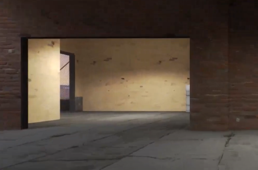
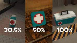
The colour palette is an earthy, grungy and very “New York” style, giving it this musty feeling which fits as it is a battleground set in 60’s America. The only pops of colour are red for your team, the blue of the enemy robots’ spawn marking, and a few signs in the signature red and blue. This really helps them stand out and guides the player through the map in a very natural way. Healing items and ammo stand out around the map so they are easy to locate, since the map doesn’t use many shades on the items they seem very bold.
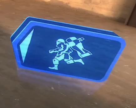
Indicational arrows are used to guide you through the map, which can be controversial but I think these are very helpful for new players, as the maps have so many ways to get to one point it can be a little overwhelming for a new player navigating for the first time. These arrows are the same colour as your team and are spaced far enough apart that they don’t feel overabundant and don’t create a crowded feeling. These are noted as explicit information by well-respected level designer Tommy Norberg and his point is that implicit navigation in games can be better as they can help with world-building as nothing stands out, but in this case, I think the arrows are incredibly helpful and due to them having a character on it they feel immersive despite standing out. There are not many dead ends in this map, allowing the player to move freely from place to place and it helps each class work to their own advantage, so snipers can find a high-up vantage spot and fast classes such as Scout can weave through buildings to confuse enemies.
There are good looping areas in the map, even for a first-person shooter, which Tommy Norberg also teaches is highly effective at making a smaller map feel good to the player as they loop around buildings and staircases, allowing for very dynamic play-styles and means the player has to physically turn the camera often which avoids too casual of a game experience where you can just walk forward the whole map.
There are environmental hazards around the map such as the main bridge you can push robots off to force them to take a longer path, a large grinder built into the floor near a bot spawn point which you can push them into for a near instant kill but can also be killed yourself, which adds a fun level of risk/reward for taking down more powerful enemies. This gives the player choices in how they kill the enemy, rather than just shooting them, to keep the game feeling fresh.
The verticality in this map is excellent as there are many sets of stairs and areas to climb up and beams of wood connecting the high-up areas, effectively creating another whole level to the map that can make for exciting gameplay. There are cargo crates that can be jumped on and allow for all classes to get as high as they wish so long-term players can experiment with playing various classes differently, such as placing automatic turrets higher up to see if they don’t get destroyed as easily, or playing a heavy with a gun that reduces your mobility when shooting and using the beams as a vantage point so you’re harder to hit. There are also small hidden platforms that allow you to skip the long walk if you upgrade movement speed so the designs encourage the shop system.
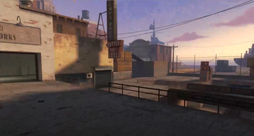
The contrast in the map is impeccable, with the building and height contrast helping the level feel special. You can tell the map was made with each class type in mind as there are spots and map routes that are perfect for each class, such as jumps that can be made by rocket jumping, a technique only performable by two classes. Kedhrin Gonzalez, an FPS game developer, spoke in an interview about keeping the player engaged by having an exploration factor to the maps, and in TF2 this is done by having multiple routes and depending on what class you play you will mainly be in different areas such as snipers being high up and spies in hiding spots. In level design, there is an exercise called the Whiteboard Test made by Robert Yang and it states that if you were to draw a map on a whiteboard it would most likely be very flat, which makes for a poor level. But, a more skilled level designer controls the line of sight of the player so that they have to move about to see more of the map and to encourage engagement as you cannot just sit still. Mannhattan’s design utilises this by using lots of sharp turns and buildings blocking your line of sight, forcing the player to move around more.
The map fits the guidelines to be considered a G.O.A.T. map (greatest of all time) according to Andrew Yoder’s GDC talk on casual combat maps. The map is full of big open environments with little cover, forcing you into engaging combat and is a highly iconic map within the fanbase and one of the most loved MvM maps that many high-rank players frequent. It has a distinct look to it, with the enemy spawns on the downslope being perfect for all classes to really utilise each of their perks. It also has that sandbox of play with unique mechanics such as the grinders built into the floor that you can push robots into and cargo boxes you can use to get into advantageous sniping spots. Lastly, they also create conflict through simplicity as in the overall picture it is not a complex map with extreme architecture and complex mechanics, rather opting for more simple and organic shapes, but it does this well as from its simplicity it builds a perfect environment for conflict as you can move around with ease.
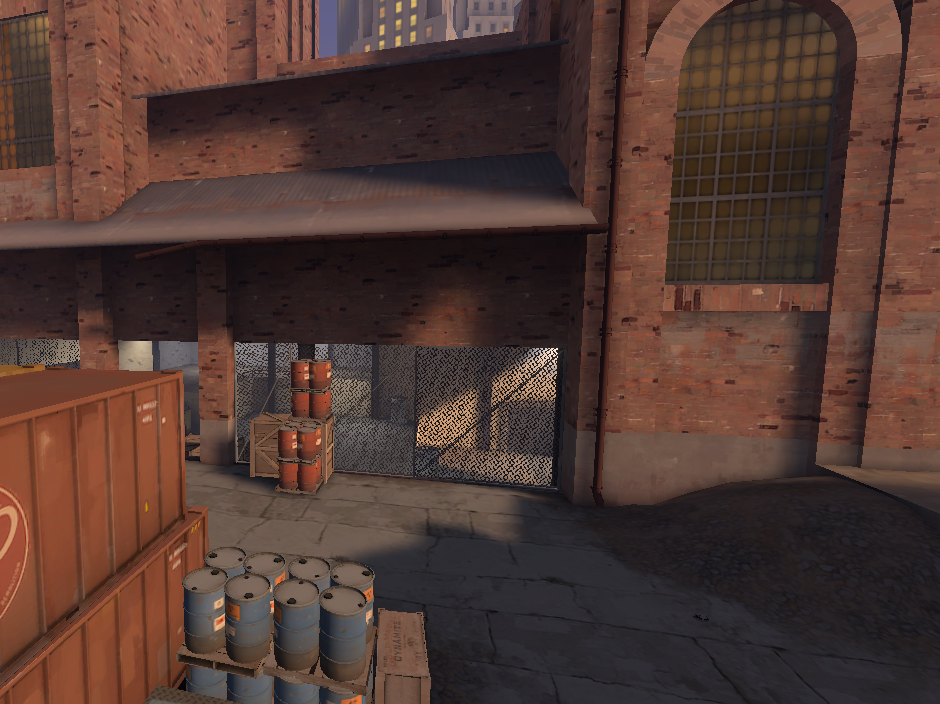
I would say that Mannhattan is a perfect casual map as it is very easy to play if it is your first time playing MvM, having very clear spawns and paths to get from the shop to the other side, which I cannot say all of the MvM maps do as many players have found themselves getting lost in complex loops but Mannhattans arrows and dead ends are very helpful at dissuading this issue. There is also an example of ‘rebound and chaos’ with sentry buster robots able to kill even highly skilled players which keeps the game difficult for everyone. There is the choice to shop and buy upgrades on certain parts of your character, this is a key part of the game and skilled players will use utilize it to its full extent, whereas newer players can have a period of experimentation testing out different character builds. It sounds counterintuitive but having limited tactics keeps it friendly to new players and allows for a high skill ceiling for experienced players, who will have mastered these tactics, which keeps players around as you can always get better.
The enemy spawn points are a highlight of the map as there are three and they each offer a different level of difficulty. First, there is the iconic beginning spawn with a 45-degree slope that the enemies jump down on that allows for good turret placement, ample sniping spots and good spots for tank classes too. There is a second spawn closer to the base which feels very cramped which ups the difficulty but also has a grinder that can be used for efficiency. Lastly is the hardest spawn which is very close to your base with a very open feel and many vantage points, but little to no cover. Each spawn has its own benefits and disadvantages which makes it feel very fresh each time the map is played, as players will attempt it hundreds of times but need to keep that feeling of difficulty or else it would lose its novelty.
A small thing to some but the item placement is perfect, as it allows dying players to duck into small areas of cover to get healing and ammo, which is a quick break from the fast-paced combat, to recuperate your thoughts for a moment. They are sprinkled throughout the map so no matter the position of the player, if in need, they can find the necessary supplies yet at the same time there is not an overabundance so that it feels too easy and gets rid of the need for classes such as the Medic.
Overall I believe that this is one of the most iconic maps in TF2 and especially in the MvM game mode. Having it be both easy to play for new players, yet having such a high skill level for placement and upgrades that it doesn’t get old, solidifies it as the true best map in my eyes and many others.
Reference list:
wiki.teamfortress.com. (n.d.). Mannhattan – Official TF2 Wiki | Official Team Fortress Wiki. [online] Available at: https://wiki.teamfortress.com/wiki/Mannhattan [Accessed 13 Nov. 2022].
www.teamfortress.com. (n.d.). Team Fortress 2. [online] Available at: https://www.teamfortress.com/.[Accessed 13 Nov. 2022].
steamcharts.com. (n.d.). Team Fortress 2 – Steam Charts. [online] Available at: https://steamcharts.com/app/440. [Accessed 13 Nov. 2022].
developer.valvesoftware.com. (n.d.). TF2 Design Theory – Valve Developer Community. [online] Available at: https://developer.valvesoftware.com/wiki/TF2_Design_Theory [Accessed 14 Nov. 2022].
www.youtube.com. (n.d.). Brand New TF2 Mann vs Machine map Manhattan walkthrough HD. [online] Available at: https://www.youtube.com/watch?v=8vGm6SGUFww [Accessed 14 Nov. 2022].
www.youtube.com. (n.d.). How Does Team Fortress 2 Craft Good Maps? | Video Game Design. [online] Available at: https://www.youtube.com/watch?v=uDRSMFOEMcs [Accessed 14 Nov. 2022].
www.teamfortress.com. (n.d.). Team Fortress 2 – Mann vs. Machine. [online] Available at: https://www.teamfortress.com/mvm/#:~:text=in%20your%20browser.- [Accessed 14 Nov. 2022].
Norberg, T. (2020). Implicit & Explicit Information. [online] Tommy Norberg. Available at: https://www.tommynorberg.com/post/implicit-explicit-information [Accessed 15 Nov. 2022].
PolsonBloggerMay 22, J. and 2012 (2012). First-person shooter design: What to save, and what to frag. [online] Game Developer. Available at: https://www.gamedeveloper.com/design/first-person-shooter-design-what-to-save-and-what-to-frag [Accessed 15 Nov. 2022].
Wagar, C. (2018). Good FPS Map Design. [online] Chris Wagar’s CritPoints. Available at: https://critpoints.net/2018/02/18/good-fps-map-design/ [Accessed 15 Nov. 2022].
Twitter. (n.d.). https://twitter.com/radiatoryang. [online] Available at: https://twitter.com/radiatoryang [Accessed 15 Nov. 2022].
www.youtube.com. (n.d.). The Holy Grail of Multiplayer Level Design: Casual and Competitive Maps. [online] Available at: https://www.youtube.com/watch?v=NhMDTxnzQuA. [Accessed 15 Nov. 2022].
